Showing posts with label art quilt process. Show all posts

Tuesday, February 21, 2012

Quiltfest Gallery - Part 4

 This is part 4 of the gallery tour, the other parts can be found here, one, two, three.

OK, you're back, lets carry on our trip around the show. Our first quilt today is another that I hadn't intended to show, but it filled a tricky space and I like it so, here it is. I think more than anything this one shows my age, it's K.I.T.T. from Knight Rider. I was never much bothered by the people in the series but I fell for the car in a big way. In fact the ring tone on my phone has been the theme tune from the show since it has been possible to set them. Ah if only you could fit the whole of my talk into a 1981 Transam.

It seems this is the most eagerly expected quilt by my blog readers. Dragon 1 (yes the first dragon is technically Dragon 0). If you are a regular reader of my blog you will have seen me working on this one just before the show. I think it came off the frame 3 or 4 days before the show. If you missed those posts they start on the 8th of January, so start at the bottom of this page.

I was hoping that this quilt would look like it was drawn in water colour pencils. It is actually a wholecloth quilt with the design made entirely in thread. The starting image for this quilt was the preliminary sketch by Glenn Wallbridge,  for my first dragon tattoo. Bonus points to the readers who spotted that while I was working on it. It is stitched onto another piece of cotton sateen
 hand dyed by Heide Stoll-Weber. The image was scaled up to be the biggest I could fit on the cloth I had. I managed to use the whole piece with just enough to bind the quilt. I am very stingy when it comes to Heide's fabrics. Being hand dyed it does have variations in colour, but in this case they are all shades of the same grey. All the colour on the quilt comes from the threads used.

On the top of the quilt the threads are King Tut, Signature and Aurifil, and in the bobbin I use Masterpiece. I only use cotton threads in my work. Maybe it is old fashioned and snobby, but it's what I do and I can't see me changing any time soon. It does somewhat limit my colour options.

Rather than mark directly onto the quilt I prefer to do my marking on wash away stabiliser. Over the time I have been quilting ever marking tool I have used has let me down at least once despite my testing them all before I use them. The stabiliser keeps the markings that little bit further from the quilt. If I can avoid  marking altogether I do. In this case though I needed some help. This project was a huge challenge for me. I don't draw and my grasp of drawing and shading techniques is very basic. I had to learn and fast.

This is also a style of quilt I had mostly written off. I always match my bobbin thread colour to my top thread colour. This means all of my art quilts have a wholecloth art quilt on the reverse. It seemed to be a poor deal to make an art quilt as a wholecloth. I'd only get one quilt for my work not two. Who doesn't like something for free.

I learned a lot here, and having done this quilt I will do more in a similar style. I've got ideas for stretching the number of colours I can get in thread, and I can see other ways of laying down thread. I want to play with stabilisers and different waddings. This quilt has Warm and Natural in it, as that was the densest wadding I had to hand. I think more solid ones would be even better. I just need the time to play now.

Here is another older of my older quilts. I made it to try and get a quilt into an American show. The show had the theme 'Celebrate Spring', and I had been spending a lot of time at the National Gallery. Cherry blossom in an impressionist style seemed the obvious choice. This was another quilt that took me out side of my comfort zone and had me trying new things. I loaded the frame with a calico backing a layer of 80/20 wadding and another layer of calico. On the calico I marked where the bridge path and river needed to go, then I started colouring in.

All the colour comes from 1" squares of fabric. I laid a few pieces down then stitched them into place with a pattern appropriate to what they were representing. So the bushes are quilted with leaves and the path with pebbles. The wood on the bridge has a grain to it and every blossom has a flower quilted on it. Most of the picture was made from the top down, the tree though I had to add from the bottom up. I just couldn't get my head around working it the other way.

In Full Bloom did it's job. It was accepted into the Celebrate Spring show and was the first quilt I exhibited in the USA.

That's the end of the wall. Let take a look at the items hung elsewhere in the gallery. We've walked around a large plinth in the middle of the room, holding a dress on a display form.

In 2009 I was asked to take part in a new feature at the Festival of Quilts, a fashion show. There were teams from the UK and Russia and each member of each team was to make four items. Day wear, evening wear, accessory and fantasy. I wasn't that interested until I heard that last one. I'd been thinking for a while about making a suit of armour and this seemed like the perfect excuse. Unfortunately, because it is quite fragile and it was too bulky to store when we had to take the show down, I couldn't display it at Quiltfest. If you would like to see it, it is on this video.

So, by deduction, the dress isn't my fantasy category. It was actually my evening wear. I've enjoyed making Victorian style clothes for years so it seemed like an obvious starting point. I also thought it was something I could add quilting to without ending up with a shapeless garment. I had issues with big shapeless coats and tops, well to be honest they have an issue with me. They make me look way bigger than I am and that is quite big enough to start with. I suppose the alternative would be to not put much quilting on the garment, but that really isn't my way of doing things. If you ask me for quilted fashions, you had better believe they will be quilted.

The patterns for this outfit are all from Truly Victorian. The skirt and bodice are patterns I have used before but the train had just been in my wish list. Again the show gave me a good excuse to do something I'd been thinking about for years.

As I've said if I am going to make a quilted garment it has to be quilted. This gave me a problem, how could I make a proper three layer quilt that would be soft and light enough to craft the train from.  I came up with using organza. The train is three layers of organza. Silver top and bottom with black as the 'wadding'. It is two widths of organza wide, about 80" and approximately 120" long. I had to guess the length as the pattern for the train went missing just as I was ready to load the organza on the train. I thought I had loaded up more than I could possible need but actually another 20"-30" would have been good.

The quilting for the train was started at the hem and as with all my work is just freehand. The body of the train is quilted with feathers in various styles and colours. Starting with black at the hem and working up to lighter grey at the bustle. The bustled section is quilted with my curls, which really only add texture, you don't see the design at all.
 The train is hemmed with heavy black lace. This I bought a roll of as I knew I would need several meters. I am flattered by those who ask if I made it, but I really can't face that much lace making.

The back of the bodice is decorated with two lace panels. These were also purchased from Vena Cava Designs. This is a fantastic UK company that sells all sorts of corset supplies and fancy pieces like these laces.  I had actually gone to the site to buy more spiral bones for the bodice but when I  saw these motifs I had to have them.

The next problem I came up with was how do I get into this outfit in a hurry. At the time I was planning it we were expecting a change time of about 5 minutes. That doesn't give me long enough to get into a corset so the bodice had to do the job of the corset. However I wasn't prepared to have laces on show. I settled on making the bodice very tight and using lare hooks and eyes to close it. It does mean I need a dresser (although that was going to be essential for the fast change anyway) to haul the bodice shut. It works surprisingly well and is pretty comfortable too.

The larger panels of the skirt were quilted on oversize sections of fabric that had been roughly cut to shape. The lining is black cotton and the outer is a cotton sateen. The wadding is a Dream Orient. It is a fantastic clothing wading. It is a blend of cotton, silk and bamboo, it drapes really nicely. I did use some marking on wash away stabiliser to make sure the panels on each side are mirror images of each other.

The top of the skirt and the black areas of the bodice were yardage I quilted before cutting the panels. They are quilted with and all over leaf and vine pattern. The front panel of both the bodice and the skirt and bodice are the same three layers as the rest of the garment but with an added layer of silver organza over the top.

The bodice is then trimmed with the same lace as the train and has lace sleeves. Although the quilting was all done on my longarm the assembly was done on an hand cranked sewing machine in my motorhome. It was the biggest space I had to work in and it was easy to keep completely cat free. Cats and organza don't mix.


 The outfit was named Victorian Steampunk by Susan Briscoe.


 The last quilt for today is hanging right next to the dress. Being a double sided quilt it couldn't be hung against the wall. It's also very three dimensional so it doesn't hang well that way. Fortunately Susan had these hooks and chains in her car. She claims she thought they would come in handy for hanging quilts! Well I suppose she was right and the  metal bars on the gallery ceiling turned out to be well placed as well.

The quilt, well technically two joined quilts, does have a hanging gap at the top to insert a rod. The base of each side of the quilt is three layers stitched together. Both have a stiff interfacing as their backing. It can't be seen and it gives a stable base, both for the textile components and the electronics embedded within it.

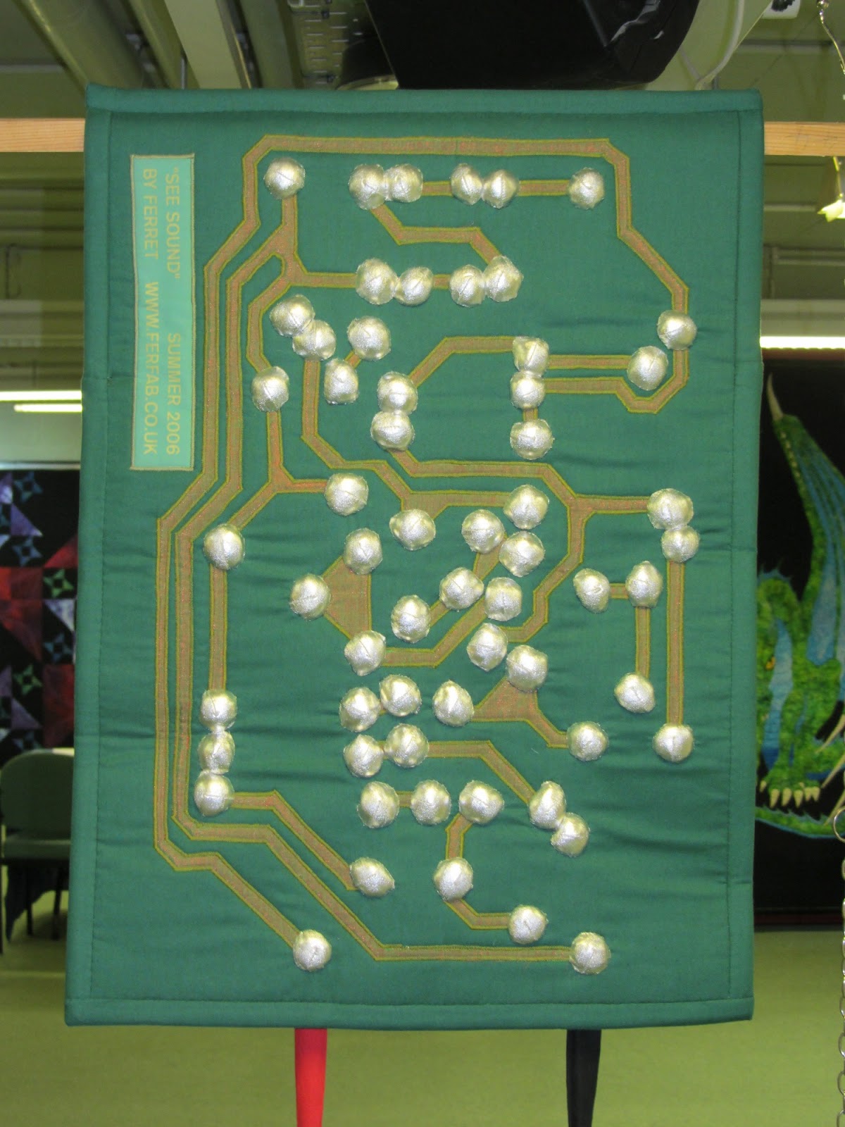
The quilt reacts to sounds, so when you talk to it the lights flash. I made it to give quilts a way to interact with the audience when they cannot be touched. Being so tactile I do think quilts miss out when they aren't handled, but having seen how much damage people do to quilts I have to support the no touching rule.

The resistors are not only the correct values, they are also the same way round as they are on the board. Yes, very sad and pedantic. The back of the quilt shows the tracks of the board and the solder spots. It is the hardest 'soldering' I have ever done. Hand stitching this silver fabric was a bear.

Sunday, September 04, 2011

Art Quilt

Thank you all for your help, it's been much appreciated. After much discussion and chasing down all the suggestions that came in, three of us have just sat down to name the quilt. Tet, the model and I each chose our favourites. Of course we didn't pick any one the same so some negotiation took place. After some entertaining mistypes we realised some titles I can't be trusted with so we went for simple. The quilt is now called, Quiet Moment.

I found it really interesting the different things people saw in the image, it's something I really love about making art quilts. They go and talk to people in so many different ways. I do love the idea that this quilt is linked to Wait, and this title works in with that idea. There were some titles suggested that may appear later. I have some other pieces in the planning that we think they might fit rather well.

Now Tet can get on and finish the calendar, which was the critical job. I am really look8ing forward to that now. We've just got back from Harrogate quilt show, which I will post about tomorrow, but for now I think it's bed time. Why did they put Harrogate so far away?


Saturday, September 03, 2011

Art Quilt - name me please

I've just realised the art quilt needs a name. Urgently. I am producing my new calendar and it will be in there, so it needs a name by Monday when the calendar has to go to the printers. I may work well under pressure but I'm not so good at naming things that way. So, can you help me please. Here is the finished (well almost it's not bound yet) quilt, what should it's name be? Please leave your answers in the comments then other people can share what they think of the current suggestions. I names one of my other quilts like this and that worked really well so I have high hopes for your creativity. Please feel free to share this link and see if anyone you know has any ideas.

Wednesday, August 31, 2011

Art quilts - shoes and things

 If you remember last time I showed the top of this thigh I had paused my quilting to add some more detail to the arm behind it. Now you can see what I meant. There is a shadow on the arm and her bracelet. Pausing when I did just made for a tidier edge. When I was working on the lower legs I also made use of the thread to do the feet. It saved a couple of thread changes at least. One of the downsides of doing this sort of work (and especially the way I approach it) is the number of thread changes. It's surprising how much time and thread that eats up.

 Once I had the bulk of the body quilted I went looking for threads for the shoes. Would you believe I had trouble matching those as well? I really think Moda need to bring out a range of threads to match their fabrics. I've got a lot of thread but I could only get close to two of the blues. I had an almost perfect match for the second lightest and decided to use that on the palest areas as well, after all those are just highlights right and using the slightly darker colour will just add detail.

The other shade I could match fairly well was the darkest although to be honest my thread was a little dark. I couldn't just leave the mid blue unquilted but I didn't have a blue thread even close. So I tried grey. I use a lot of grey as most of the time it blends in really well with other colours. Unfortunately I had a little too light and a little too dark and it didn't want to play ball.

Fortunately luck came to my rescue. I looked at the machine. The purple it was loaded with at that moment was very blue looking, and about the right shade. Amazing it's a pretty close match and was right in front of me. I did swap the bobbin thread I used with it so if the bobbin did show at all it would add blue to the mix not purple.  I used about 15 threads in this quilt and I really didn't have enough. I will be looking to extend my collection sooner rather than later.

 I really enjoyed working on the shoes I think the quilting probably adds more to them than any area other than the hair. Suddenly you can see the ribbons and the curves of the feet. In this picture you can also see that the background quilting has more or less kept pace with the rest of the quilt and in the one below why that is so important.

The body quilting really does draw in the quilt a lot and if the fullness in the background is just left it becomes really difficult to quilt in without tucks despite the fact it is all one piece of cloth so we know it must have fitted once.

As I said at the beginning I did roll back and take another look at the hair before I unloaded the quilt. I decided I couldn't add any more quilting. The quilt had enough distortion already I didn't want to add more. It is now pinned out being blocked to flatten everything before I trim it up.

Monday, August 29, 2011

Art quilts - legs


 I've made the thumbnails a bit smaller today because I wanted to share more pictures that usual, you can still click on them to get the full size images.

The legs seemed quite simple at first glance then as I thought about it more I realised how much was actually going on that wasn't being shown by the shades of the fabric. The most obvious area was where the top leg met the arm, both were the same colour and needed to be separated by the quilting. There are many more subtle areas too, the knee for example needed some sort of transition as did the lower leg and body.

As ever I started where I could see what was going on with the highlights on the muscles. I was trying to both follow the underlying contours of the leg and the shape of the fabric. It did mean making some compromises but it came together. The next lightest shade on the top leg was also fairly easy to deal with, although I had to start thinking about the fold in the leg, with this colour.

 By the third shade I was clearly coming up against the crease behind the knee, but more importantly I spotted some details I wanted to add to the arm. In one of the pictures you can just see a couple of pieces of paper off to the side. I stopped here to work out what needed adding and decided I needed to leave that area of the leg until I had put some more detail on the arm so I could tuck in the edge of fabrics that were supposed to be further back. It's amazing how often quilting past something can point out a problem with it.

I left that for later and went on the lower part of the leg. By comparison this bit is easy. There are some fiddly narrow pieces to control but at least the shape is clear and simple. You can see in this area what I meant about the arm and the leg trying to blend together.

You might also notice that in some places there is a lot of fabric to persuade into quite small places. As I am quilting fairly densely the quilt is drawing up as I go so pieces further down seem to big to fit. They will but the need a lot of coaxing. Its one of the reasons I longarm one handed. I use my left hand to manipulate the fabric as I work in just the same way I did on the domestic machines. It worked there right so it must work here, and it does. It also scares people when they see me doing it. I do have my fingers very very close to the foot of the machine, I have to if I am manipulating small pieces. Yes it is possible to sew through your finger but mostly I get hit by the needle screw, it hurts but it lets me get the fabric to do what I want.

 The lower leg is again more of a challenge than I first thought. The tiny piece of dark fabric is the where the calf muscle is pressing against the thigh, so again the quilting needs to change direction there to provide the appropriate shape. It is also a good example of silly little things that are critical to the overall design. When I am teaching my art quilt classes I do talk a lot about small things that matter and small things that don't. I try to explain how to tell the difference because there is no way to make a list of them. This may not seem important but trust me if it wasn't there you would know it was wrong.

Sunday, August 28, 2011

Art quilt - shoulder and chest

 While I am working on the quilting I have a print out of the image next to me. I use this for two things. The first is to allow me to keep checking the fabric pieces as I go along. and certainly on this quilt there has been quite a lot of editing as I have quilted. I am looking for places where the pieces are the wrong shape or colour or are completely missing. There are usually a few bits I failed to trace at some stage and others that have gone missing during the cutting so the constant reference to the printed image is really important.


The other use for the image is to translate the strange shapes into a human. It's hard enough to tell what the fabric represents in the photographs, but trust me it is far harder in real life and it is one of the reasons I always take a lot of pictures they help. Once I have worked out what the fabric is trying to show I can try and figure out which way the the quilting lines need to go to improve the image. Fortunately with humans I do at least have a sample on hand. You can feel your own shoulder and feel where the bones are. I've done different styles of quilting on different quilts but for this one I am trying to have the quilting follow the body structure. It's fiddly but it seems to work quite well.

The collar bone was fairly easy to deal with and the indentation next to it. The central section of the chest was harder to sort out so I decided to start work on the opposite arm instead. I tend to jump about a lot. When I can see what needs to be done on an areas I do it, and come back to the trickier pieces. Sometimes the tricky bits have vanished in the easy bits which is always nice.


 The pins in the quilt are marking transitions to give me some guidelines. Quite often one shade of fabric will span multiple body parts and for this quilt I want the quilting to separate them. I like to use pins for marking as they are easy to remove. I've had enough bad experiences with marking tools I try not to use them at all now. You can see on the arm how I have followed the line of the arm but also the shape of the fabric. I don't want to use the same colour thread on the two areas. If I did the thread would be very visible on one of the fabrics, which could make it too invasive. The thread may also reduce the contrast in the shades of the fabrics. Sometimes that can be helpful, but on the whole I want the best match I can get. On this quilt I had some problems choosing the palest fabric. It wasn't really as pale as I would like, so the thread I used on it is bright white, just to lift it a little.


I applied the same principles for the top of the other arm  and quilted a bit more of the background. Mostly the background is keeping pace with the quilting on the image.


Saturday, August 27, 2011

Art Quilt - quilting the hair

 First let me say it is very very difficult to photograph the quilting when it matches that fabric and the quilt is still on the frame, but I've done my best. Hopefully if you click on the images you will get the idea.

As I think I mentioned in my last post about this quilt I had some problems finding the right colours of thread. After turning the house (and van) upside down I did find a few more. I found far more that were the wrong purples though. Of course all the threads I really wanted to use didn't want to play ball. Some of them I have never managed to get to run on my machine and I really should get around to either chucking them out or rehoming them before I waste more time playing with them. I did try them and I did fail.

After a lot of fiddling I did persuade masterpiece to run provided I kept the speed right down, which for me, quilting hair just wasn't going to work. I think hair is my favourite part of quilting people. It's the easiest for me so work out what I am doing and it tends to flow better than other areas of the quilt. I can also be more flexible with my thread colours as I want to blend the fabric shades more in the hair than anywhere else.

I started with the darkest thread to start getting the direction of the hair in place. The dark thread was the one happiest running at speed which made it easier for me to get the flow right.  From there I could work on the mid shades. These had to be stitched slower, which I found hard, but possible once I had the dark lines in place to keep me going in the right direction. I was also looking to secure as many of the raw edges as possible at this stage, it makes the quilting easier later.

As you can see in the firs picture as soon as I start quilting the hair it draws in the quilt. This can leave me with a lot of fabric to ease in in the background. I deal with this by doing a bit of background quilting every so often. It not only keeps everything in place and behaving but it gives me a rest too. The background is quicker more flowing quilting that I don't need to think too much about. Yes, I often do a bit of it when I get stuck on something on the main image, or indeed when the threads annoy me too much.

I build up the quilting on the hair in stages. I want it to be ver clearly hair but I can't quilt it too densely or it will distort the quilt even with the uber wadding in it. I worked on the hair until it read OK and I will come back to it when I have finished the rest of the quilting. If I think I can add a little more quilting I will. It is one area that really benefits from heavy quilting.


Thursday, August 25, 2011

Art quilt loaded ready to quilt

Having done the two urgent customer quilts I can load up my art quilt. It is getting the same backing as the wholecloth I've been working on, a black floral from Moda. The wadding is the thickest 100% cotton from the dream company, it is really thick and hangs really well as a wall quilt.
The floral batik you can see pinned on to the quilt is just there to protect th applique as I work. I float my tops (and even if I didn't normally I would for these) and I don't want to brush against the pieces as I am quilting.
I was thinking I would start right away with the hair as I am happy with that part of the quilt, but then I remembered the other problem with working in purple, threads. There just aren't enough shades of blue purple thread. Lots of red purples but those don't match the fabrics I've got. The group of four cones are the quilting weight purples I've got that might work on the quilt. I'm a bit lacking in the mid ranges with them. The set of three are threads I mostly use in the bobbin. I used to use them as top threads a lot then they suddenly stopped working for me. There is a much better range of colours with them, so I think I will have to have another go and see if I can get them to run again, otherwise I think my best option would be shades of grey which do tend to pick up the colours around them so might work in a pinch.
Tonight though is a night off, I'm off to see a band with some friends. Maybe inspiration will strike overnight.

Saturday, August 20, 2011

That's the top.


 This post should have gone up yesterday but blogger could tell I was using the browser on my phone and wouldn't let me long on to the site it wanted me to email or text in the post, but that often puts the pictures out of order so I decided it was better to wait till today and do it properly. I did enjoy celebrating the World Quilt Show win with sushi last night sorry :) So just pretend it's yesterday. Don't forget you can click on the images for a bigger picture. I just make the thumbnails a bit smaller when there are this many images in a post. The darker of the fist two images is the closest to the right colour, but the brighter one is easier to see so you got both.

I got some time to work on the art quilt today. The first job was to finish the leg, it was only a couple of pieces but I think they make quite a difference. Then I needed to get on with her shoes. Maybe having a few days break had it's advantages, I've had time  to think about the colour of them. I've ended up going much more subtle than I had been planning. I finally went with blue, see quite restrained.
 After putting on the first piece I did wonder if I had made the right choice. I started with the darkest shade again. This made sure that any of the purple would be covered and hopefully the blue would be as intense as possible. I don't know that the photos really show how loud it was, but it really did make me wonder.

I decided to press on. The colours looked good off the quilt so I thought it was worth getting a good look at the effect. If I had to redo this section it wouldn't be too bad. Just adding one shade lighter started to give me hope. I wonder if part of the problem was just seeing such a large block of colour on a fairly complete image.

As each layer comes into place the shoes come to life. I love this part, where you can actually see the image appearing. After closing up the sewing room I realised that I had missed at least one piece on her shoes, but that can wait for another day. I will do another check over the whole image. I will look for any pieces that aren't quite the right shade and any details I have missed, then it will be time to quilt it. Yes that's right. My applique is not bonded or stitched until it is quilted. If the frame had been free I would have built to top in situ and quilted as soon as an area was laid in place. I find this method gives me the softest thinnest quilt, which for these is what matters to me.